Wondr Health
From MVP to a consumer-grade V1, complete with a branding overhaul and massive feature expansion, leading to dramatic gains in user acquisition, product-market fit, and new investment.
Overview
In 2020, Wondr Health approached Studio Godsey to revamp its entire mobile experience. It all started with an MVP of a new mobile app, and since then, we've become their long-term design partner and have worked with Wondr for more than two years. We've taken care of all the design and product-related challenges, designing digital products from the ground up and growing engagement through testing, iteration, and exploration. We've successfully delivered a new mobile app, an updated web app, completed a brand overhaul on all platforms, and launched many successful growth projects.
Our power lies in a strong focus on behavioral psychology and healthy habit creation, connected with a motivational and satisfying user experience, which helps users reach their weight loss goals. Further, we've managed to drive engagement from the web to mobile, significantly increasing both activation and retention rates. That led to considerable improvements in video engagement, their current north-star metric and revenue driver.
Wondr is a common-sense digital counseling program that teaches more than 220,000 participants every year simple skills to change when and how they eat instead of what they eat. It also helps with building other health habits leading to increased physical activity, better sleep, less stress and feeling more in control over their health long term.
Project Outcomes

User Reviews

Process
What we did
1. Lead design across all platforms, 2 years running
2. Redefined the strategy of a new mobile app from the ground up
3. Refreshed the experience of the web app
4. Rebranded the experience across all platforms
5. Shipped a number of successful activation and growth projects
6. Lead strategy focusing on behavior change and positive habit formation
7. Retooled experience around the primary revenue driver, video lesson engagement.
8. Built a comprehensive, scalable, design system and in-house processes
Using behavior change and healthy habit forming to help users reach their goals and increase user retention.
Key challenges
1. How might we motivate and help users reach their weight loss goals?
2. How might we increase app engagement and retention?
3. How might we motivate users to track their progress regularly?
4. How might we connect participants with others to help them support each other?
Our Approach
The project had two interconnected success metrics:
1) Helping users reach their weight loss goals
2) Increase video lesson engagement, as it is the key revenue driver.
Additionally, we discovered that activation, retention, engagement, and weight-loss success, all increased on the mobile experience vs the web. So, our goal was to tie all of these facts together, producing a user success focused mobile experience that leveraged key revenue drivers, creating a positive feedback loop that created a complimentary relationship between business and user.
We have:
1) Tested different features that prompt and motivate users to watch educational videos and motivate them to track their meals together with weight and activity progress.
2) Explored many ways to make the app experience more engaging and fun.
3) Come up with many different ideas through solid market research, industry knowledge and workshops with stakeholders.
4) Through ideation and testing have maintained a strong role throughout the process.
Additionally, we've paid strong attention to the community features, which we found to have significant impact on motivation and, in the end, retention. People enjoy being a part of something bigger with other people.
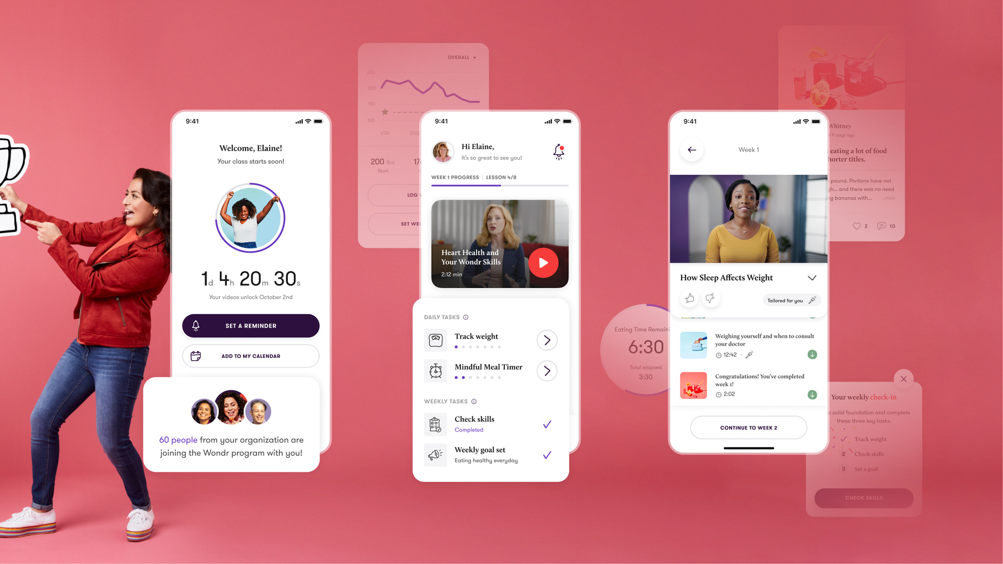
Weekly & daily tasks, combined with notifications reminders and pledges as a way to motivate users and help them create regular habits.
Increasing daily engagement in the app was a strong focus of ours, which we’ve helped by delivering these prompts regularly to the users. They can set the tasks reminders as they prefer. Moreover, by fulfilling different challenges, they receive motivational badges and celebration visuals.

Progress tracking as the way to keep users on track to reach weight goals and increase their data investment, which improves retention.
We've delivered new features focusing on weight and activity progress tracking, which motivate users to get closer to their goals. To ensure people remember all the knowledge learned in the educational videos, we've implemented a weekly skills check feature that helps them remember information and weight-loss techniques long-term.

Mindful eating techniques combined with meal logging helping participants to build the correct eating habits and keep track of their meals.
The 10-5-10 eating approach is essential to the users' success in reaching weight goals. That's why we've paid strong attention to the mindful eating feature and designed a completely new way for users to eat with a timer and track all the meals during the day.

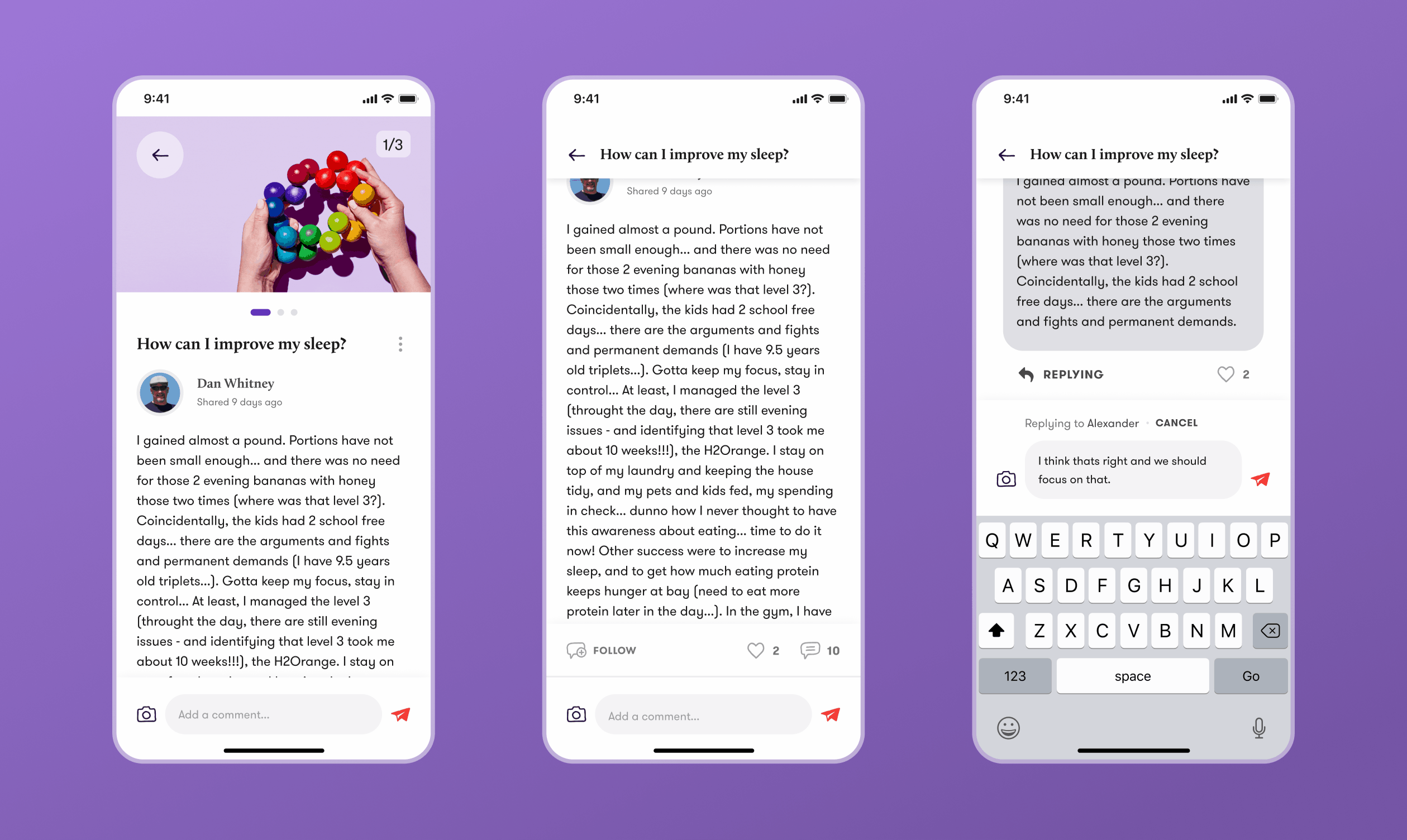
Providing participants with a community, allowing them to share their progress or ask for support both from the Wondr team and other participants, leading to increased motivation and feeling of tribe inclusion.
The goal of the WondrLink community feature was to allow users to follow the topics they are interested in while encouraging them to post their own thoughts. We had to focus intensely on well-designed interactions while commenting, liking or scrolling through the feed to give users as smooth experience as possible.
Increasing business revenue and helping users reach their goals faster through a primary experience focused on learning and video engagement.
Key challenges
1. How might we increase engagement in the video/learning section?
2. How might we make the learning process more effective?
Our Approach
The more classes participants watch, the more revenue is generated by the business model. Watching videos is also strongly connected to success in the program. The more videos participants watch, the more they are likely to succeed and lose weight. The momentum and emotional investment of users have been the key here.
That's why we've built the experience around watching videos and education as the main point of interest. We've explored many possible options to make the experience more satisfying and effective through ideation sessions and prototypes.
Additionally, we've implemented a number of progress indicators and motivating features to help users stay on track and engaged along the journey.
New, higher quality, content focusing on encouragement and engagement leading to a positive overall experience
The key to success is the content of the learning section. It has to be motivating and engaging. We've encouraged the Wondr team to build a new recording and photography studio, leading to increased content quality, which feels modern, appealing, and motivating.

Video classes as the main element of the home page, always at the user’s fingertips with a clear progress indicator motivating them to move further.
We've decided to implement a new progress indicator on the homepage to support the video-classes engagement. Further, we've made the video CTAs the most prominent, always seeking the attention of users, which led to increased click-through rates from the homepage.

Supporting momentum by providing next-step feature guiding the users throughout the journey and increasing engagement of all the features.
The momentum of the users is the key. If we lose them throughout the process, it takes a lot of time until they come back to the app. That's why we try to keep them in the app as long as possible if they are already in. We've implemented the What's Next feature into the learning section, which provides a simple path forward. For example, watch another video or try a Mindful Eating Timer.

Personalizing videos to improve engagement and allow users to learn more about what they are actually interested in.
Personalization of content has become a huge focus in the industry of digital products. We've used its power to deliver content that they care about, which at first makes them feel that we’ve listened to them and secondly makes watching content more interesting in general.

Improving overall user experience and satisfaction through a new visual and product direction supported by strong market research and a new design system.
Key challenges
1. How might we design the app flow and architecture in a way that helps users to perform all their desired tasks faster?
2. How might we keep the apps consistent across all the platforms and features?
3. How might we set the tone of voice and design direction in a way that makes the whole experience engaging and fun?
Our Approach
Improving the overall user experience was our goal at the very beginning, in addition to the new brand. We did not want to just give the app a new coat of paint. Before modifying the previous design and digging into visuals and direction, we identified what was working and what wasn’t through interaction and usability heuristics, reviews and user testing. This, in the end, moved us in the direction of creating an entirely new mobile app.
We've found out that to be able to be competitive in the market and fulfil our users' needs, we have to focus on a simple, straightforward, friendly and encouraging experience across all the platforms.
We've delivered these experience attributes through a minimalistic layout and positive visuals, together with a friendly and conversational copy. We guide users to focus on the positives during their progress and encourage them to improve every day, step by step while being mindful throughout the journey.
To be able to keep the experience simple, we had to keep it consistent across all the platforms. That's why we've, from the ground up, built a new design system which supports this goal and, in the end, also saves designers and developers a lot of time.
A simple and straightforward user interface together with encouraging visuals making the overall experience effective and fun.
The target group is mainly people over 40 years old, making this objective even more important. The goal was to allow users to accomplish all the possible user journeys as quickly as possible together with clean, easy-to-navigate visuals encouraging them the whole way through.

Conversational, engaging, and friendly copy helps users feel the human connection that is a major pillar of the Wondr experience.
Copy plays a massive role while delivering a friendly and encouraging experience. The goal was to focus on the positives.

A new design system helped the team to stay consistent across all platforms and made development more effective, scalable and organized.
As the app was growing, we’ve decided to create a design system which improves the speed of development and design by a significant margin. Further, it helped us while working on rebranding the whole Wondr program.

Driving engagement from the web to the new mobile app with increased activation, retention and engagement rates.
Key challenges
1. How might we drive more engagement from the web to mobile?
2. How might we increase the mobile app activation rate?
3. How might we make the onboarding more simple while more encouraging and fun?
3. How might we design a new iPad app without a huge dev lift?
Our Approach
In the process of designing the experiments for the activation section we’ve focused on making the onboarding entertaining and exciting while keeping it short and straightforward.
To be able to create an emotional investment in the users, we’ve emphasized providing context and asking the right questions. This way, we can discover their goals and can prioritize them throughout the whole program experience. We don’t just show them the features they should use, we tell them why they should use them and how they help them succeed.
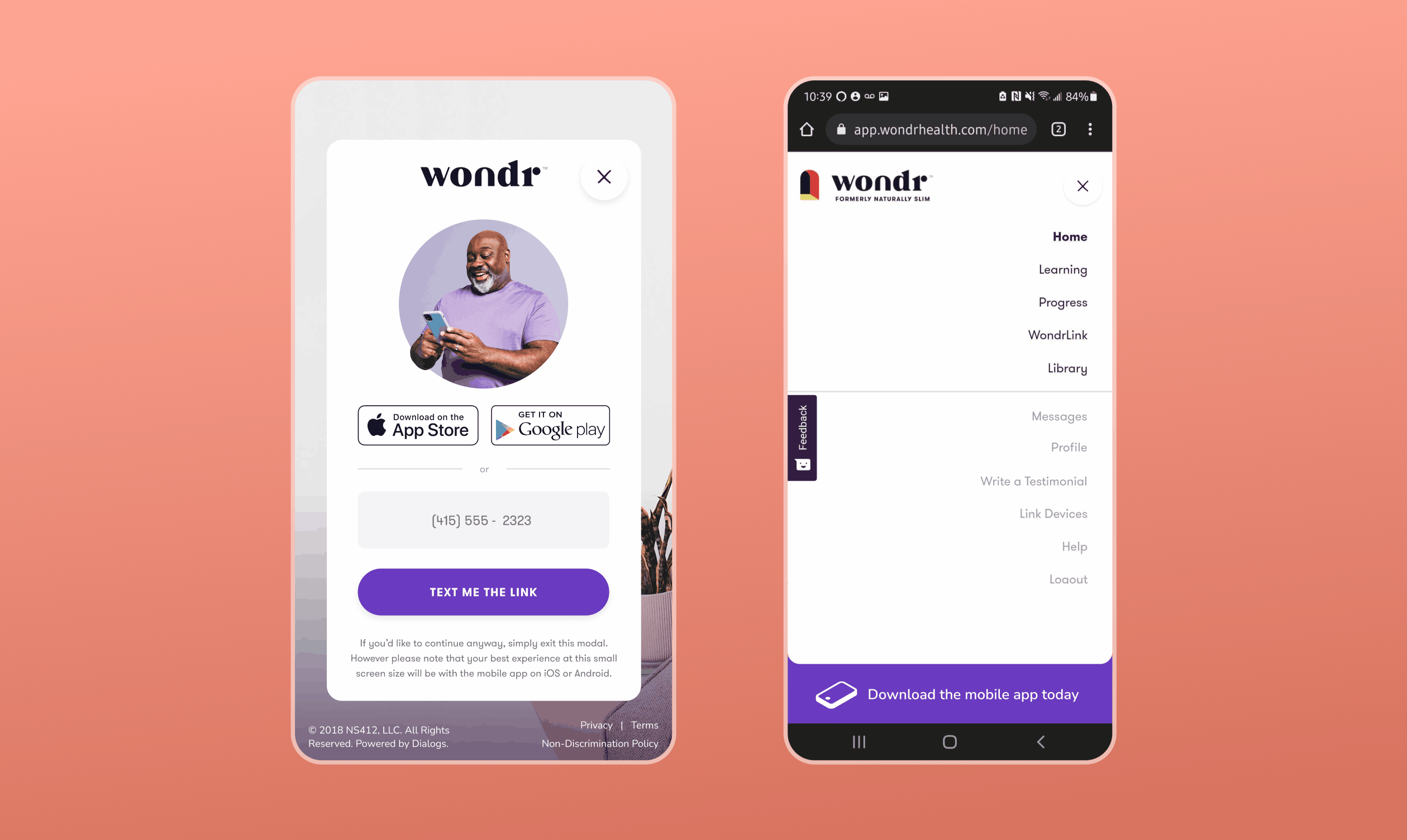
Through the iterative process we found that user engagement and goal success is much higher on the mobile platform. Because of this, we designed a number of ways to drive users to the mobile experience rather than web, while focusing on making the transition and onboarding to the new platform as smooth as possible.
Custom day-one experience with one-click log-ins increasing the activation rates by a significant margin.
We’ve found out that a lot of people drop out while waiting for their class to start. That’s why we’ve built a custom experience for this situation. They can log in using a simple one-click Google or Apple account button. Moreover, we encourage users to set a notification or calendar reminder.

Providing users separate onboarding to more complex features to give them context and make the learning as smooth as possible.
Context and emotional investment were the keys to increasing the activation rate. We've focused on finding the right balance between enough guidance and freedom.

Increasing activation rate through providing an optimized experience to iPad users.
A lot of older people prefer using an iPad to a mobile app. That's why we've developed an optimized app with more accessible buttons, typography and improved layouts working on iPad. However, the focus was to create an iPad app without a huge lift for the dev team, so we've used a lot of existing features from the mobile app and just slightly redesigned them.

Driving users from web app to mobile app, which has higher engagement rates through different prompts throughout the whole web app experience.
When we started the collaboration, most of the users were using the web app. Now, it is the opposite. We first delivered a new mobile app and then slowly started driving users from the web app through different prompts and growth experiments. The key was to make the transition from one platform to another as smooth as possible.